A room can have beautiful furniture, generous light and excellent proportions yet still feel slightly unfinished because its colour story has not been resolved. The most compelling colour trends are less about choosing the shade of the moment and more about creating atmosphere: a home that feels calm on a busy weekday, welcoming when guests arrive, and considered from one room to the next.
For contemporary Canadian homes, that often means moving beyond stark white walls and cool grey-on-grey schemes. Warmer undertones, softened contrasts and tactile finishes are shaping interiors that feel refined without becoming precious. The aim is not to follow every new palette. It is to select colours that support how you live, the natural light your home receives and the pieces you want to enjoy for years.
Colour trends are becoming warmer and more dimensional
The shift toward warmth is visible in paint, upholstery, woods and decorative finishes. Think mushroom, oat, putty, clay, tobacco, soft caramel and mineral beige rather than flat, yellow-based cream. These shades create a gentle foundation for contemporary furniture, especially pieces with clean European lines, pale oak details or sculptural silhouettes.
Warm neutrals are often mistaken for safe choices, but they require attention. A beige with a pink undertone can feel elegant beside walnut and brushed brass, while a green-grey taupe may sit more naturally with smoked glass, black metal and cool daylight. The difference is subtle in a paint swatch and much more apparent across a full wall or a large sectional.
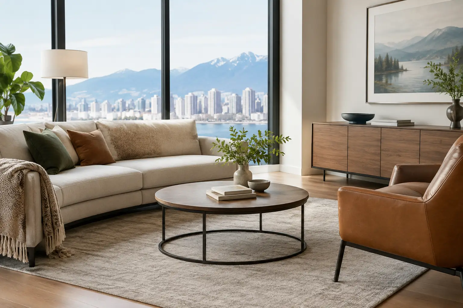
This is why a monochromatic room should never be built from one identical neutral. A successful scheme layers related tones across several materials: a warm off-white wall, a sand-coloured sofa, a textured ivory rug and a deeper mushroom chair. Variation in weave, sheen and texture prevents the room from looking washed out.
Why warm neutrals suit Canadian homes
In the GTA, natural light can change dramatically through the seasons. A bright south-facing condo may handle cooler stone and pale grey-beige finishes beautifully, while a north-facing living room often benefits from warmth to avoid feeling shadowed in winter. Artificial lighting matters as much as the window direction. Warm LEDs can make a creamy wall appear richer, while cool lighting can turn a delicate beige unexpectedly grey.
Before committing to a wall colour or custom upholstery, look at samples in the room at different times of day. Place them beside your existing flooring, millwork and window coverings rather than judging them in isolation. The most flattering choice is not necessarily the colour that looks best under showroom lighting or on a screen.
Earth-led hues bring depth without heaviness
Contemporary interiors are also making room for colours drawn from the natural world. Olive, moss, muted forest green, rust, terracotta, cinnamon, deep ocean blue and charcoal-brown offer a grounded alternative to bright, high-contrast statements. Used well, they add visual weight and character while retaining a quiet, sophisticated mood.
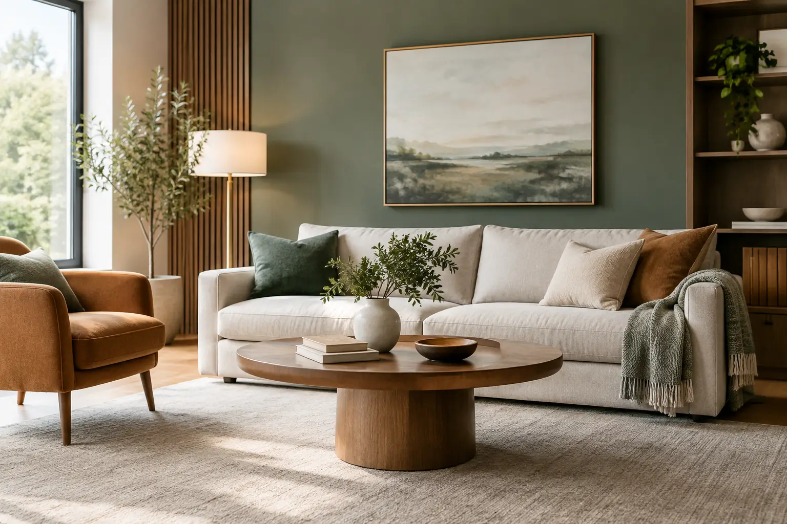
Green remains especially versatile because it bridges warm and cool materials. A muted olive dining chair can feel at home with oak, travertine, bronze and cream bouclé. A deeper green velvet occasional chair brings richness to a neutral living room without dominating it. Blue works similarly when it leans mineral or ink-like rather than overly saturated – particularly in spaces with walnut, cognac leather or blackened steel.
The trade-off is scale. Deep colours absorb light, so they can make a compact condo feel smaller when used across every major surface. In a smaller room, reserve them for a single upholstered accent chair, dining chairs, cushions, art or a lacquered sideboard. In a larger living room with substantial daylight, a low-profile sofa in tobacco, moss or deep blue can become the anchor that gives the space definition.
Let one material lead the palette
Rather than beginning with a paint chip, start with the material that will have the greatest visual presence. It may be a veined stone dining table, a richly grained walnut media unit, a boucle sectional or a patterned rug. Pull two or three colours from that material, then decide which should be the dominant tone, the supporting tone and the accent.
For example, a dining room centred on a cream stone table with warm veining might pair beautifully with camel upholstery, dark wood and soft olive accessories. The palette feels coordinated because each colour has a relationship to the stone. It is more convincing than trying to force a collection of individually attractive finishes into one room.
The new accent colour is considered, not loud
Accent colours have become more edited. Instead of scattering multiple bright shades around a room, many well-resolved interiors use one confident note repeated with restraint. A muted oxblood may appear in a lounge chair, a small artwork and the binding of a few books. A burnt orange cushion can echo the undertones in a rug. A deep plum vase may be enough to sharpen a palette of limestone, taupe and chocolate brown.
This approach makes a home feel personal while allowing investment furniture to remain flexible. A neutral sofa can move easily through changing colour preferences when its personality comes from pillows, throws, art and occasional pieces. Conversely, choosing a coloured sofa can be a rewarding decision when the shade has enough depth to read as a near-neutral. Olive, midnight blue, tobacco and warm charcoal tend to have greater staying power than trend-driven brights.
If you are drawn to a bolder colour, ask whether you love it because it suits the room or because it stands out in a photograph. Both reactions are valid, but they call for different commitments. Use the photograph-ready colour on an easily changed element if you are uncertain. Put it on a custom sofa or upholstered bed only when you can imagine enjoying it in every season.
Contrast still matters in soft palettes
A warm, tonal home needs contrast to feel intentional. It may come from a dark wood coffee table against a pale rug, matte black lighting above an ivory dining table, or a chocolate leather ottoman in a room with soft beige upholstery. Contrast gives the eye a place to rest and brings out the shape of contemporary furniture.
The key is to distribute it. One black frame or one dark cabinet can look accidental; repeating the same deep note in a table base, mirror frame, artwork or hardware gives it purpose. In open-concept spaces, this repetition also helps connect the living, dining and kitchen areas without making them match exactly.
Finish is part of the colour conversation. A matte black surface reads quieter than glossy black, just as brushed brass feels softer than polished gold. Texture can moderate stronger colours too. Deep blue velvet is more inviting than a flat synthetic blue, while a rust-toned linen has a relaxed quality that suits a family room or casual dining space.
Build a palette around permanence and flexibility
When furnishing a home, separate decisions by how difficult they are to change. Flooring, cabinetry, stone, large upholstery and window treatments are long-term choices. Their colours should feel compatible with your architecture and lifestyle, not merely this year’s mood. Accessories, art, rugs and smaller chairs offer room to experiment.
A practical approach is to choose a lasting base of two or three materials, then add a seasonal layer. Pale oak, warm white and a soft taupe textile can form the base; forest green, rust or ink blue can then enter through moveable pieces. This gives a condo or family home visual freshness without requiring a complete redesign every few years.
Customization can make this process far more precise. The right fabric, wood stain or finish can bridge an existing floor with a new dining table or sectional, especially when you are completing a room in stages. In a showroom, compare the actual fabric and finish samples beside each other. Pay attention to texture, undertone, durability and how the materials feel in the hand, not simply their colour names.
At Levida Furniture, a considered consultation can help translate a saved image or favourite swatch into a palette that works at the right scale for your home. The strongest rooms are rarely built around one trend. They are built around the way light falls across the space, the materials that feel good to live with and colours you will still be pleased to come home to.